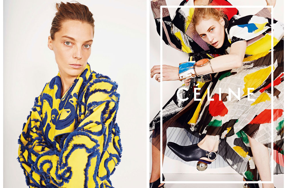
With my work I was thinking of doing the same thing and having the boys name on the page or in the border rather than 'Celine' (obviously).This could then add a more personal touch to the images of my models, making them more personal or leading the viewer to connect with the image more. I really like how the borders are simple and overlaid on the picture, rather than a standard border around the image.

No comments:
Post a Comment