Monday, 21 April 2014

SHOOT 2 - EXPERIMENTS


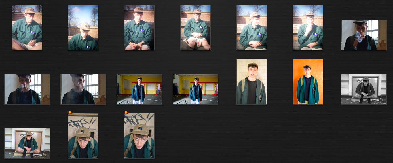
Using photoshop and my research knowledge I've started to make designs/ edits of my images, for example including borders. Just to see how I can manipulate them creatively to add a current, bold look to my zine. 

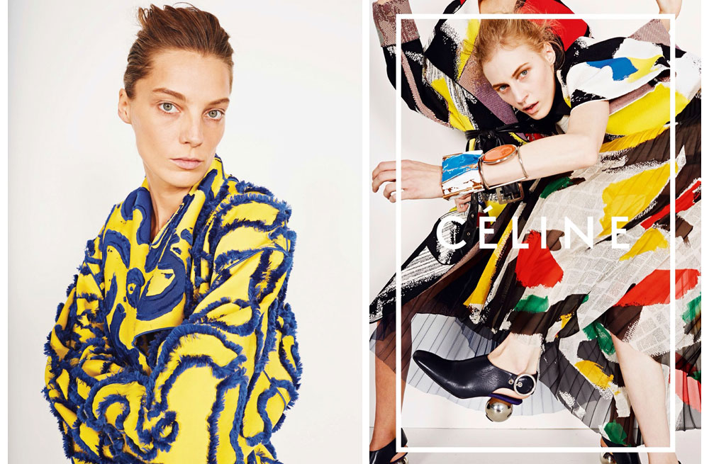
The one below I really don't like - the edit that is. I tried to recreate a Celine campaign image by incorporating a white border and writing across the middle, however I feel that this attempt failed - maybe another image would work better perhaps? Aspects of this experiment that doesn't work would definitely be how big the font is and the colour. The colour green does work within a male genre magazines however overlaid on this image, it's just not very appealing and doesn't add anything to the image. The white border also doesn't work on this image because it's not bold enough on the lighting that comes through. The border would probably work better had I put it in yellow or black - this is something I could try. 


Intense black and white edit - I edited this image to black and white because I wanted to make the smoke look really intense and bold. I really like how grey the image is, it makes his clothes stand out more and also works really well with the smoke. I like the small glimpses of light within the image also, that only make some of the sections brighter, such as his jumper or the wall behind him, it adds some depth to the image. 


I cant work out if I actually like this overlaid image or not. There's elements I like but also I feel that it looks too easily done - like there hasn't been much effort put into it. I do however like how it intensifies his expression but repeating it 2 and a half times. You also see the clothes numerous times which could work as a selling point - had it been put in a campaign. 
I'm also not sure if it would work with the other designs I plan to put in my magazine, like this one isn't bold enough or bright enough compared to the others. Saying this though, it could juxtapose quite nicely by adding a toned down element to the zine. 


The two below I would say are my favourite edits and are pretty much exactly how I want some of my images to be displayed in my zine. For the borders I took inspiration out of Phenix magazine (will show  you in a later post) and also Topmans magazine. However instead of using bold colours or patterns, I used some of my landscape images from the shoot and used them as the background. The reason for this is I wanted my work to appear edgy, bold, more urban than pop or punk, so I feel like the run down images really create a story between the two images. This then gives the image more of a portrait appeal rather than solely fashion element - which I would guess men reading my zine would prefer. 

As you can see I used the same image for both, this was purely just a practice. I will be applying this idea/effect to my other images. I really like how the colours of the borders work with the image, so this is something to consider when making borders for my other images.


I took this idea from a Banksy image (again, will post about later.. ). I the effect itself was simple to do on photoshop. I created a pixelised image then saved it, opened up both of the images again and overlaid the pixilised one on top of the original. The reason I thought this would be an interesting and appropriate effect to try was that I wanted to add some focus to the clothes, so by pixelising his face out, you're drawn more to the clothes and then you found yourself figuring out the abstracted face. 


SHOOT 2- HOLGA LENS EXPERIMENT


SHOOT 2- CHOSEN IMAGES


SHOOT 2


This shoot was taken in an abandoned school in the Nottingham area. The key factors I focused on in this shoot were keeping the male casual, sunshine and location. The model - Lindon Cox - is a close friend of mine and his fashion sense is very relaxed however he looks good for it. It's like a  mixture between indie/hipster and school kid, his style has always fascinated me and thats why I wanted to take pictures of him. Overall I was very lucky with this shoot because despite the location being extremely hard to get into, no one was injured (thank god) and the weather was on my side. 

Throughout this shoot I also experimented with a HOLGA lens to see what lomo/ instagram effects I could get. The reason behind this was that I want to keep my pictures playful, current and relaxed and I feel these effects do that. I'm yet to decide whether I like them or not but it's nice to see something different. 


ALASDAIR MCLELLAN

Another photographer I found in I-D and really liked was Alasdair Mclellan. His work shown in the magazine is more portraiture based but It really works with my project. Also whilst researching about the man himself I found out that he actually also attended Nottingham Trent Uni which is extremely inspiring.  He's done work for Topshop, Man about town and taken pictures of top end celebrities such as Beyonce, Pharrell, Cara Delevigne etc. His work is truly amazing and definitely something to admire. 


I just love the lighting in his images, it's so bright and natural and really compliments the men and their features. I want to use only natural lighting through out my work - although being only april, it's proving a little difficult to get the perfect sun light. The above image is interesting because he looks like he's half been captured in movement, yet it also looks set up the same time - it's intriguing and eye catching. The clothes stand out, yet again its not obvious that the photographer is trying to sell them to us. I like how the location isn't particularly interesting, just brick walls because for my shoots, i've been trying to find unique and weird locations, when really the model should be the main focus.  

The image below I love because the juxtaposition between the landscape and the portrait works incredibly well. The tones are similar, the lighting is similar. It creates a story between the male and that place, is it somewhere he goes regularly? It creates a story and I find that extremely fascinating. 
Although these images haven't got anything to do with fashion, this is definitely something I could experiment with when it comes to my men in fashion shoots and the landscape shoots i've taken at the same time. 


Another of my favourites. The male, the colour, the clothes - everything just screams out I-D magazine. Which is exactly where I found this image. I think its great, it's quirky and fun and that's a huge thing to  accomplish with images like these. I want to try get some laid back 'fun' natural shots in my zine of my models, it creates a chilled vibe which I really like. Theres also something about this image that screams out 90's rave to me, which is actually current at the moment - everyones bringing out the 90's fashion and music. So for my zine, maybe I should think about current bands or eras that people are fascinating over, to keep my zine fashion conscious. 


The two below I picked to show because I love the different poses and also the intense depths of field used. The males are 100 percent in focus and your main focal point. Mclellans used the same practice yet both images are so different from each other. I love how natural the one directly below looks yet I also like the intensity of the other one. The males stare directly at the camera, is gripping and beautiful. You really look at him and start to notice the other little elements in the image, such as his eye colour, his freckles etc. 


The image of Devlin below is completely different to the other images, yet still has an interesting style about it. I like how the back ground is more in focus than the model, the depth of field has been challenged and I think it works really well. You can still see the model and his clothes, but he's not too in your face. You find that that the back ground and framing is more eye catching than the man. The black and white gives it a real edge as well, making everything appear bleak and sharp, adding some emotive connotations to the image. You wonder about the mans state of mind - theres so many elements to this image that I would love to practice in my own shoots. 


His book :  Ultimate clothing company 
Is a book i'd be really interested in viewing, looking at for research and also just to have for my own personal collection. I absolutely love his work and am so intrigued by how he buts them together etc. 


BRUNO STAUB

Bruno Staub is a photographer I can across in I-D Magazine. I really liked how his images of men and mens fashion were very casual and had a chilled vibe about them - this is exactly the same notion I want for my images. He uses interesting models, ones that are often short haired and less of a stereotypical 'model'.  Sometimes his work can have a snapshot aesthetic about it which is more intriguing and sways his work more towards portraiture than fashion. 

"New York based photographer Bruno Staub is known for his fashion portraits, published in magazines like Elle, Dazed & Confused and GQ. For i-D, Bruno has photographed Adam Driver, A$AP Rock and most recently Mykki Blanco. Bruno also landed a cover last winter with his story in the Wise Up issue, featuring Will Chalker and baby Martha. Other clients include Dior Homme, Perry Ellis and Louis Vuitton."
 - I-D MAGAZINE 2014


The image is above is different to the work I have been producing but I really like the grey tones and the simplicity of it. The models expression is fascinating also which makes the work more grubbing despite being a standard portraiture shot. Not only this, like I mentioned earlier the model isn't considered a stereotypical model and thats what I like. This works really work with my own photography practice because I'm not using men who look like typical models. 


The work above is very similar to the previous image, however I intrigued by the page layout and tones. The blues and violets juxtapose really nicely with the serious and formal stance and expressions on the males face. I also like how the images slightly overlap, giving them more of a relationship / paring. I also like how again, the clothing aspect isn't too obvious or in your face, it feels like more works has gone into the style of the page and tones, than the actual clothes - it's very clever and fascinating. You notice the clothes but at the same time you don't feel like they're being sold to you. 


I'm starting to notice a pattern with his work / or the images I'm choosing and that would be the actual pose the males are doing - they're all posing the same. It's slightly frustrating. However above is another image I feel matches my work. It's on location, its a male and he's wearing a fashionable top - perfect. A negative to this though would be that I feel the image only looks this good due to the model being used, a lot is riding on the appearance of the man in the image. 


CELINE CAMPAIGN

Whilst researching through magazines I came across the Celine fashion campaign and was really inspired by the layout of their adverts. They're bold, bright and eye catching. The border being on one picture juxtaposed with a simple picture on the other side really keeps the page interesting and adds a more arty and creative value to it. 

With my work I was thinking of doing the same thing and having the boys name on the page or in the border rather than 'Celine' (obviously).This could then add a more personal touch to the images of my models, making them more personal or leading the viewer to connect with the image more. I really like how the borders are simple and overlaid on the picture, rather than a standard border around the image.