Thursday, 29 May 2014

BELLY BANDS

Another element I am including in my zine would be a belly band, which is a band that goes round the middle of the book, it keeps it shut but also holds everything together - if there is more than one book/zine. I feel that this would be a good element for me to include as I have two books that need to be together. 

Heres an example of what I mean: 


Bog Town Zine would be the image that would closely relate to what I want my belly band to look like. I simply - like the aboves example - want mine to be plain back, but with the zines name or logo in the middle. Currently I plan on having the abbreviated name in the middle in white, orator font.  I am still yet to make my own belly band, which I will have on here and also my sketch book. 


Illustration booklet images and design

You've already have some insight into how my illustration booklet will look from the previous images and if you reflect back on my very first layout based post, you'll know what design this book will be in. But on top of this, I have created a collage of illustrations and images, which is my final design : 


There is still a bit of tweaking to do regarding the image just above. I need to make sure each image has its own small page (rectangle shape) and also I need to make a decision as to whether I change the colours slightly of the bug and ice cream - as the design is used on the other side. However if I chose to keep the colours how they are, I feel that this won't matter too much as this booklet is designed to turn into a poster, so the reader would have to chose one side any way - one side wont be seen. 

MY ILLUSTRATIONS


With these designs and some others, I will merged them all together to create one big design which I will be using for my illustrations booklet.


Making my Illustrations.

Part of my idea when creating my zine was to include illustrations or an illustration booklet. Originally I was going to include art work by the males in my images, however men being men, they didn't get them to be in time - lots of excuses and miscommunication, boo. However, I didn't let this effect me, I then decided to make my own illustrations using the adobe programme - Illustrator (of course).  With this I took the one drawing my managed to get hold of from the lads, and scanned it to my emails : 


^Here is the scanned image.

Then by opening this onto photoshop, I cropped the image into small individual sections. This was because I wanted to use each drawing separately in my zine. Below are some examples of what I mean. 


These three designs come up most in my zine as I felt they worked the best with the male, dark vibe I wanted. But also in the illustrations booklet, when I make them bright coloured etc, they will look very bizarre. 

So then from this I opened them into illustrator. Here is a step by step of how I made parts of my designs from the above drawings : 

Firstly I created a second layer, once I had opened my image onto the white page. You create the layer so you can delete the original image behind the drawings - this obviously is then your new image. For all my drawings I used a black 3pt pencil brush, so that all my illustrations would be the same thickness - I chose a thicker pen because it created the bold dark effect I wanted within my zine. 


Below you can see what the image looks like with the layer taken away, from that you can then copy all the line and drag into indesign. This is what I did when placing it into my zine and illustration booklet. 


Here's the process with another image- it's the same for everything. 


Not only this though, I also created my own illustrations from my own photographs, images, online sources and even my new images of the models. With these it was the same process, however they were a lot trickier due to the amount of detail, but due to the fact there was so much detail, I was able to pick and chose what I wanted to add into the design. So with this, I kept them pretty simple because I liked the quirky effect that was created. Here's some examples :


The above image is the second process of making my illustrations. I did this in Adobe Photoshop, simply using the paint bucket tool. This image will be used in my booklet of illustrations. I made a concious decision to make the images bold like the one above because I felt that the zine would look to dark with all the blacks and greys and wouldn't 100 percent represent the males personalities, so this separate booklet with all the bright colours would be act as the second part of their personalities. I will be posting my other designs shortly... 

HACHI MAG - INSPIRATION

I desperately needed more inspiration for my zine, so I went back to my trusty and favourite online magazine publishers - ISSUU - and found HACHI magazine. 


Firstly what caught my eye with this magazine was the interesting portrait image and the simple layout of the front cover. The male models eyes catch your attentions straight away which automatically made me want to open the magazine. Also I liked that the logo was very much how I imagined mine to be - simple. They haven't gone over the top of it or tried to do something extreme and over designed.  

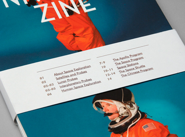
Once I opened the magazine, I was also impressed by the various layouts they used for their images. This is the main reason I began to research into other zines, I needed more inspiration for the layouts in my own zine - I don't want the same designs on each page, this would get very boring for the reader and it also lacks imagination or creativity, something zines are supposed to express.  A couple of layouts I really liked were : 


The first image I would say is the easiest to create, I really liked the juxtaposition of the images. How they're both portrait but slightly off centred, borders are different and also different sizes, it slightly throws you off a little which is an element I like - however I'm not sure if a reader would like this design. Also my zine wont be including much writing so that part of the image I wont be including. I think this is positive though as I don't actually like the writing as part of the design. I also dislike the black lines they've incorporated into it as well, I don't feel that they are necessary and make the page look messier.  

The second image is a design I loved but found difficult when making mock books of my zine. I found that because most of my images - well in fact all images - are of models, if I was to include an image in this way, the models face would have been cut in half which would have gave them an odd look and distracted you from the image - which is definitely something I don't want.  

3rd Image- I love, love love. This effect looks seriously cool and for some bizzarre reason a lot of people are making images in this style at the moment. I would have really liked to use this design, however due to the fact I don't have many pages to create my zine with, I don't have the luxury of showing the same image twice - if I find that I do though, I will definitely be including this in my final copy of my zine. 

Change of LOGO

Previously I was researching into different ways of showing my zines logo / name and experimented on Photoshop with the designs to find the perfect one. I did like the ones I had came up with, however when it came to the making process of the zine, I found that they either looked tacky, unprofessional, try hard or not my desired style. They weren't looking how I imagined them , so once again I had to get the old chalkboard out and start from scratch... However this time it was simple, I've been a fan of abbrivating words, short titles that don't make sense - such as musicians like DEADMAUS5 or CHVRCHES - and thought that I would keep the initial name of 'Im the son of rage and love' but shorten it to the letters. So my logo would simply be 'ITSOR&L' then in the inside of my zine would be the actual title - so readers would still understand it.  Also with this I would make my title a simple font such as Orator, so that I could then use it within the zine to create an on going theme - having a particular style running through. 

Wednesday, 28 May 2014

Layout Change

There was quite a few complications with the last layout I chose for my zine, simply because printing made it difficult. It didn't matter what paper I used , every time I folded it into the design it would rub the ink of the poster image off the edges where it was folded. Also, due to the size I wanted to make it, I also couldn't photocopy my zine, as it was too big - and it would have been impossible to scan each section individually as the zine was made from one piece of paper. With this in mind, I still want to use the design, but I will be using it for the illustrations book/ poster - just to switch designs up a bit and also with this I wont be including just one poster image, there will be lots of small images that wont get damaged by folding. 

So for my main zine, I have decided to make a continuous fold out booklet.  Such as:


(Sorry it was the best picture I could find) A picture of my design will be up soon! -

-simply because after many trials and making many many mock zines (which can be found in my sketch book) I found that this was the most effective way to make my zine more interactive and it was easier to add more pages. Not only this, it has a fun element to it, as its double sided and springs out. Another thing I loved about this design is that it will have a more rugged look as I plan on sticking the edges with black electrical tape - creating that home made appearance I was researching into previously-  which will hold the zine together but can also be a design element. Which will be a good twist on creating something that hasn't been made professionally into looking more design based and professional. 

Not only this but I will also be creating a holder for my zine - basically a type of dust jacket, but also looks like a mini fold out zine. My zine will be able to slot in without have to be stuck down due to the folds and how you slot them together. I will also be making a 'belly band' which will hold the zine, zine holder and illustrations booklet together. Sounds complicated but I have already made the mock up for all of these books, which can be seen in my sketch book.  Each book will have a particular design which when placed onto of each other works well also as a separate design. The belly band I plan on making black with the logo in the middle, just to tie in with the overall design and to match with the main zines colours.