
Another man is a mens fashion magazine, I suppose you could say its like the male equivalent to ID magazine in terms of originality and contents. I looked at this magazine for inspiration on my shoots and also for the publishing of my own ZINE.
I really like the front cover as its simple and doesn't tell you much about the contents of the magazine. The image taking up the whole page catches your eyes but isn't too tacky or garish. The image itself is simple yet shows the fashion side to the magazine and also the modern 'hipster' look. It links really well with the aspect of photography. Also the typography is simple so it can appeal to a range of people rather than aiming the magazine to one type of man. The colour contrasts with the image yet works ascetically really well. I might take this idea into consideration when creating my own zine, as the inside of mine I plan to be really creative - so this works perfectly.


The inside of the magazine is on glossy paper which I like about the magazine but this isn't an attribute I would want for my zine as I want mine to be homemade and more of a newspaper. For this magazine however it looks good. The images taking spread over the whole page with no border is something I would include in my zine however I don't think it makes them different or creative. I want to add some homemade or outlandish designs to my images to make them stand out, these ones here are just standard campaign shoots - something which mine won't be.
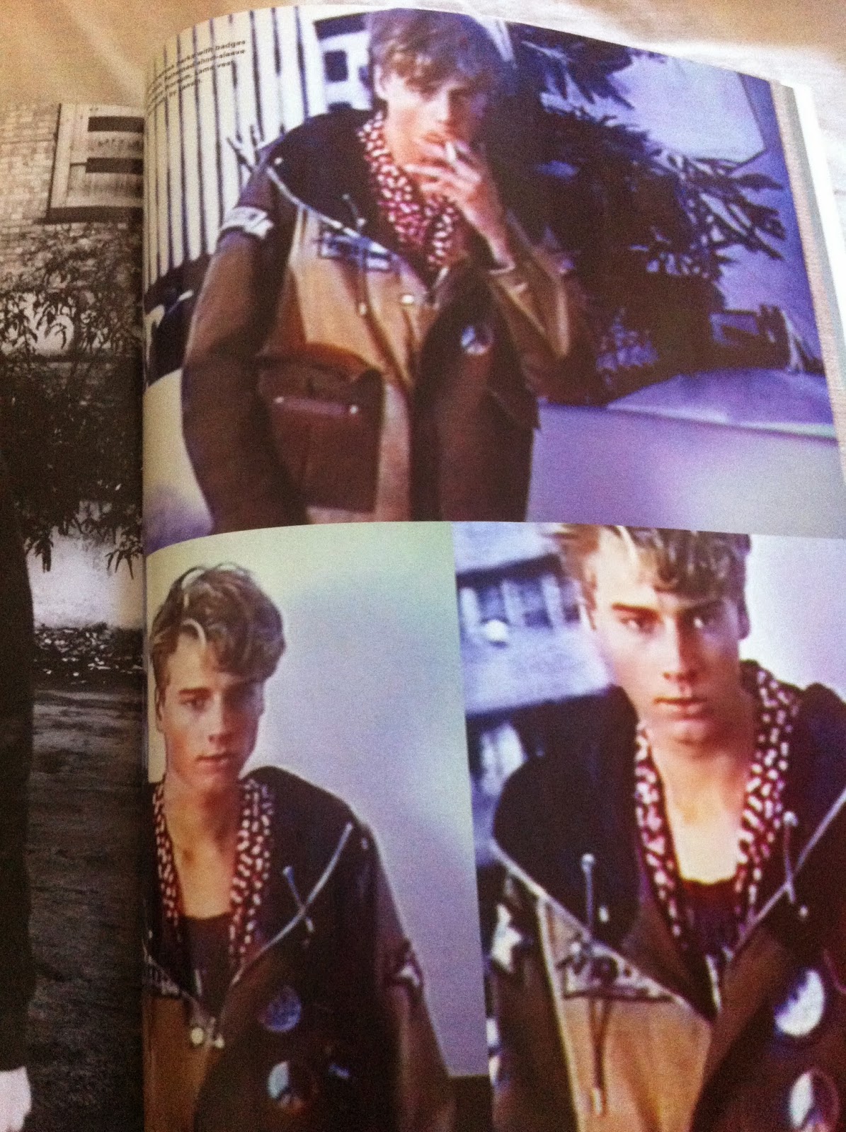
Not only did I look at these for ideas of the layout but also for the photography itself. The magazine has given me inspiration for my own shoots for example how to pose my models or even how not to pose them. I really like the bottom image as it has more of a snap shot appeal to it rather than typically posed like the other two images. I also like how the male is looking away from the camera.

The above image is exactly the style I want to use on some of the pages in my zine. The contrasts of backgrounds and borders really make the image pop and create a more interesting look to a typical posed fashion image. It adds a sense of fun to the page which is extremely appealing and definitely makes the magazine more interesting - it takes away the sometimes boring element to these magazines.


These two images were shown side by side in the magazine. I like how the images are different sizes on both pages and that they have a white border around them. Theres a lot of space around the images which I like, it guides your eyes to look at the image in more detail. I also like how they don't necessarily look like your typical fashion studio shots, which is an aspect I hope my images have. I want to explore images like this more and research into the photographer of Vivienne Westwoods campaign because the style of these images is fascinating and eye catching, they have a chilled yet stylised vibe which interests me.


Again the top images are taken from the magazine and I've looked at them for both photography ideas and also layout ideas. Things I really like in these images would be the square layout with the borders, this is another type of layout I will be trying to incorporate in my zine, I like the slight polaroid playful look it has to it. I also really like the juxtaposition of the the three images which are all slightly different, I like how there has been a landscape scene strategically thrown in. By doing this it has tied all the images together and set the 'scene' so to speak. I would say my favourite out of the lot would be the bottom image, as again, there has been use of unique styled borders and the image itself is really chilled and has a street style vibe to it. The image (which has obviously been set up) doesn't look too posed or typically fashion conscious, which I really like - it isn't obvious that the photographer is trying to sell you the clothes the male is wearing, yet at the same time you want to know where they're from.


The above images are being used for shoot ideas and inspirations. I love the range of poses and the fact that all of these pages have come from the same magazine, it just shows how each page is interesting. It stops you from wondering off or getting bored of it, the magazine is more intriguing.

Image taken for ideas on typography. I like it because it's simple yet not at the same time. The use of pastel colours is really on trend and works well against the dark background - making it stand out.


Layout and image ideas ^
Definitely really like the black and white and the juxtaposition between the main image and all the smaller images. They're placed like a contact sheet which is a nice connection with photography rather than focusing only on the fashion side to the images.

More typography :
There seems to be a theme throughout the magazine. They use simple fonts but by having them a range of colours it adds a more interesting element to the pages and the use of colour makes the page stand out also.


^ Nick knight images - I'll be exploring this photographer more to get inspiration on how I can make my fashion images more creative.


Ideas for poses and how the model should look. I really like the above image, they have a really calm vibe to them and I think they work really well as a layout - this is something to think about, I could have two similar images placed together.


^Types of typography within the magazine. The first image is interesting, the layout of the text is eye catching and the hint of bold colour at the bottom highlights the main element of the page, yet still encourages you to read it. It also makes the page more interesting rather than just staring at loads of text in black and white.


The above images are here to show you ideas of layouts and the photography. I really like some of the work amongst this selection. The images of Joe Cole are the most fascinating because they're the type of images i want to be taking. They're more photography / art based then typical glamourous fashion shots - which I personally feel are quite cheesy - I suppose an example of this would be the last two images. However I've included those images because I like the style in which they've been shown. The images are on newspaper material than taken again as a campaign - this is something that I could try experimenting with. I also like the way the magazine have included black and white images next to colour ones. This is something that I want to do in my zine, this way you're not stuck with having one particular style of images through out.
Another aspect I like is the hand writing, I might try experimenting with this in my zine, either by writing on an image then taking the picture of the image with writing again (if that makes sense) or just simply hand writing in my zine.
AnOther Man has been really helpful and has given me a lot to think about in regards to my zine and images. It's definitely one to look at if you're into mens fashion.
No comments:
Post a Comment