Beat Magazine was the first zine that I got inspiration from regarding this project. The magazine is made of a newspaper type material which is the paper i want to use for my zine. The size of the paper is A3 which I love as it makes all the photography inside stand out - I'm a bit of a sucker for images being printed quite big, I like how eye catching they are.
The front cover I feel really works because it doesn't say much about the contents of the paper which adds an air of mystery to it - makes the paper more interesting and intriguing. Also the use of blue and red, bold colours and 'cool' typography really adds a modern and young feel to it, its attracting young creative people, which I hope my zine aims to do as well.
The name BEAT - has loose connotations to music which works well as this magazine is all about music. The title isn't completely obvious and doesn't give too much away, it's also really rememberable - these are factors I need to take into consideration with my zine.
^newspaper material, image shown to see how much contents is in the paper.
^Thinking of ways to layout my own images.
I really like the above images because despite them being quite similar they add movement to the page, which connotes this element of music. Working really well with the theme of the paper. The tones of the image are interesting, modern and has the lomography appeal to it which is currently really popular and on trend at the moment - something to think about.
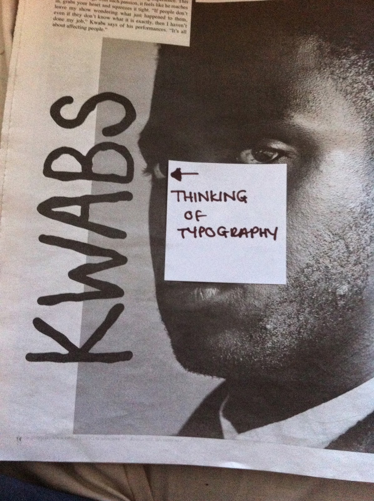
Typography -
I really like the layout of this page, the image is still the key focus but adding the interesting font over it slightly adds to that art


No comments:
Post a Comment